

When a photograph becomes a Fine Art print, the image does not simply move from a screen onto a sheet of paper.
Something else happens.
The photograph becomes physical.
Light behaves differently.
Blacks behave differently.
Midtones can become softer or deeper.
Highlights can open or compress.
Texture can become part of the experience.
Even the way the viewer approaches the artwork can change.
That is why fine art paper is not simply a technical support for an image. It is part of the final artwork.
At OX Fine Art, the choice of fine art paper begins with the photograph itself.
We do not start by asking:
“Which paper is the best?”
We start with a different question:
“What does this photograph need in order to become the artwork it was meant to be?”
That distinction is important.
There is no universal best paper for Fine Art printing. There is the paper that best serves a particular image, intention, lighting condition, presentation and emotional experience. This principle is also reflected in professional paper-selection guidance: paper choice should consider both the physical feel of the paper and its technical behavior, including thickness, tone, texture and printing response.
For Olavo Xavier, this decision is part of the artistic process itself. His current artistic process describes testing paper, tones and framing until the image “sounds right.” The photograph comes from sensation, but the final work is refined through physical decisions.
It is easy to think of fine art printing paper as something chosen after the creative work is finished.
In reality, the paper can influence how that creative work is perceived.
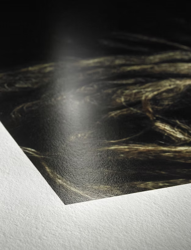
A photograph with very deep shadows may need a surface capable of preserving those dark values without losing detail.
A quiet black-and-white image may benefit from a matte surface that keeps reflections under control.
A photograph with restrained colors may benefit from a neutral, smooth cotton paper that allows subtle transitions to remain visible.
A strongly textured artwork may call for a paper whose surface becomes part of the visual language.
This is why paper for Fine Art printing should never be selected by catalog description alone.
The paper needs to be seen.
And, ideally, tested with the actual photograph.
Before choosing fine art paper, we look at the photograph.
Is it black and white?
Is the contrast strong?
Are the shadows deep?
Are the transitions delicate?
Are there very subtle colors?
Are there highly saturated areas?
Is the image architectural?
Organic?
Minimal?
Textural?
Atmospheric?
The paper has to respond to those characteristics.
This is one of the most important lessons for anyone researching how to choose Fine Art paper:
Do not choose the paper first. Understand the image first.
Other professional print guides reach a similar conclusion. Mestres da Moldura, for example, separates paper recommendations according to characteristics such as dramatic black-and-white contrast, delicate portraits, colorful images, and textured artwork.
Black and white photography can look simple.
It is not.
When color disappears, tonal differences become much more important.
The distinction between black and charcoal.
Between white and warm white.
Between a deep shadow and a slightly lifted dark tone.
Between a soft gray and a neutral gray.
This is why fine art paper for black and white photography needs to be evaluated carefully.
Olavo’s work frequently uses black and white as an artistic language, not merely as a post-processing effect. OX describes monochrome photography as a way of emphasizing light, form, contrast and silence.
The surface of the paper influences how those tonal relationships are perceived.
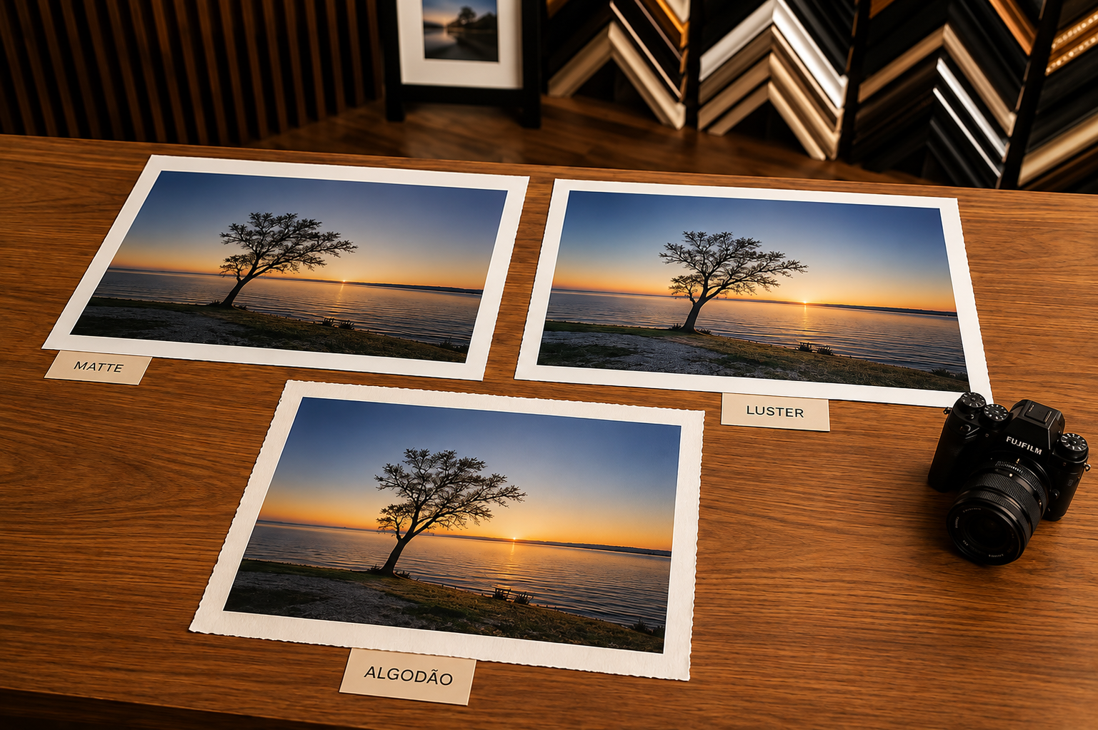
A matte cotton paper can produce a restrained and quiet experience.
A baryta-type surface can create a different sense of contrast, density and visual depth.
There is no universal winner.
The right choice depends on what the photograph is trying to say.
Professional paper guidance also emphasizes that blacks are influenced by the interaction between ink and paper, meaning the same photograph can produce different levels of density and contrast on different media.
For many Fine Art photographs, a matte fine art paper creates an especially sophisticated experience.
The absence of strong surface reflection allows the viewer to concentrate on the image rather than on glare.
This can be especially valuable when the artwork will be displayed under changing interior lighting.
Canson notes that matte papers are particularly suited to exhibition situations because they reflect less light, while their surface can also work well with black-and-white and darker imagery.
At OX, the current Fine Art printing workflow states that Olavo favors 100% cotton rag with a premium matte inkjet coating, such as Hahnemühle Photo Rag 308 gsm, especially for black-and-white and restrained color. The surface is chosen for tonal transitions, detail and archival expectations.
That does not mean every OX photograph is automatically printed on the same paper.
It means that this kind of fine art paper is an important reference point in the way the work is evaluated.
Another category is baryta paper.
Baryta papers are often chosen when the artist wants more pronounced blacks, contrast, clarity or a photographic surface that feels closer to traditional darkroom papers.
Professional printing references commonly associate baryta-type papers with stronger blacks, contrast and a more photographic character. Mestres da Moldura, for example, recommends Baryta Photographique II for dramatic black-and-white work and deep shadows, while Rossler describes Photo Rag Baryta as a choice for deep blacks and stronger color reproduction.
But stronger contrast is not always better.
A photograph can lose its subtlety if the paper pushes the image farther than the artist intended.
That is why fine art paper has to be considered in relation to the image, not independently from it.
The goal is not to create the darkest black possible.
The goal is to create the right black for the photograph.
Not every Fine Art photograph needs a perfectly smooth surface.
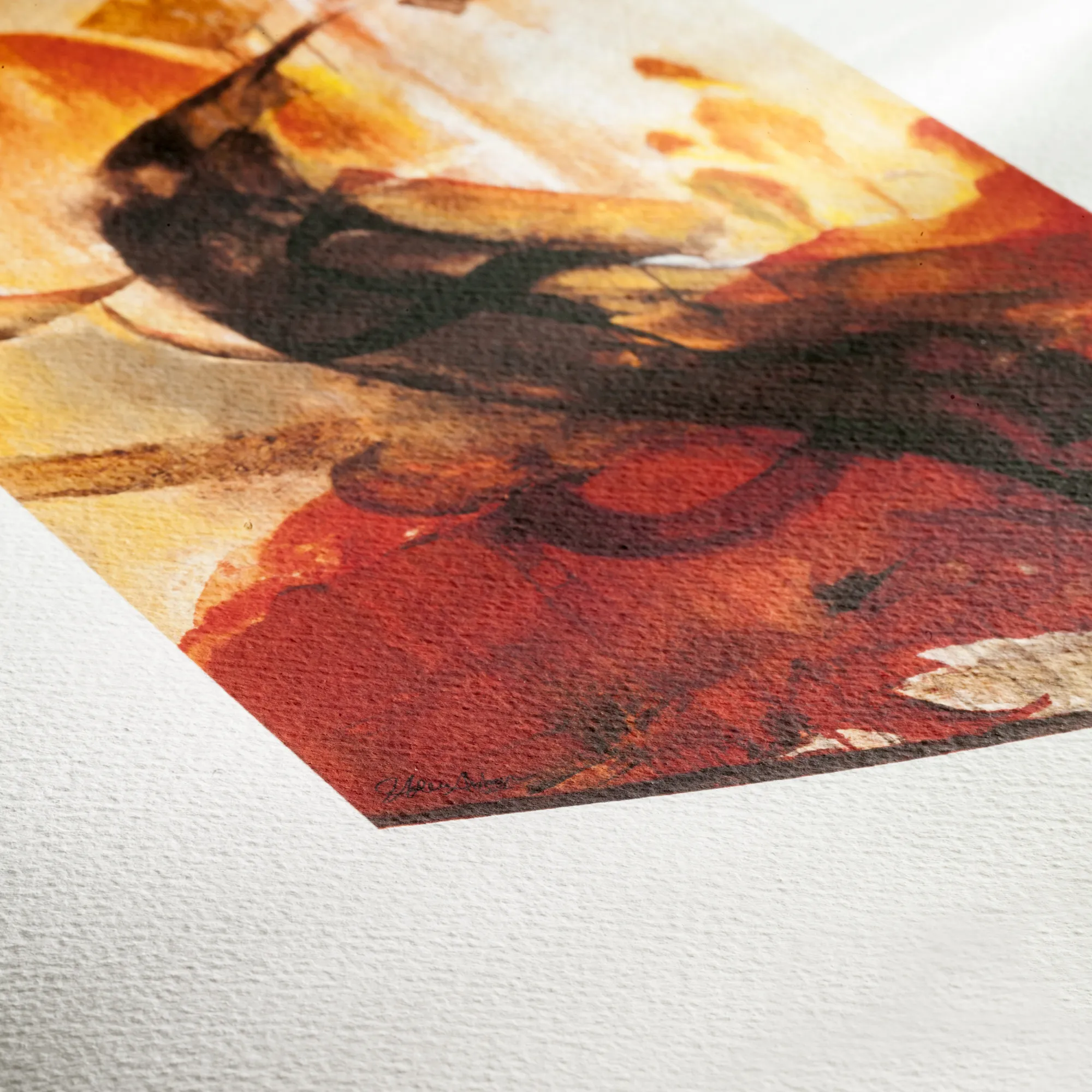
Texture can become part of the experience.
For some images, especially those with an expressive, painterly or highly atmospheric character, the physical surface of the paper can reinforce the image.
Rossler’s paper guide, for example, distinguishes between smooth Photo Rag, baryta, and more heavily textured papers such as Arches Aquarelle Rag, explaining that texture can support a more classical or tactile visual language.
But texture has to be used carefully.
A heavily textured paper can interfere with very fine photographic detail.
It can become distracting in a minimalist image.
It can also change how the work behaves under different lighting.
This is why we never choose a Fine Art printing paper simply because its texture looks impressive in isolation.
The question is:
Does the texture make the photograph better?
If the answer is no, the texture is unnecessary.
One detail many people overlook when choosing fine art paper for photography is the base tone of the paper.
Some papers appear cooler.
Others feel warmer.
That difference can be subtle, but it can affect the final perception of an image.
This is particularly important in:
Canson notes that papers can differ in tone and that the paper’s white point can influence the appearance of gray tones, especially in black-and-white photography.
For OX, this means paper selection also involves asking:
How should the white feel?
Pure?
Warm?
Neutral?
Soft?
The answer comes from the image.
One of the most common terms in Fine Art paper is “100% cotton.”
In simple terms, it refers to the composition of the paper’s base fibers.
Cotton rag papers are widely used in Fine Art printing because they can provide a premium tactile quality and are available with archival properties appropriate for artwork intended for long-term display. OX’s current printing workflow specifically states a preference for 100% cotton rag with premium matte inkjet coating for black-and-white and restrained color work.
But “100% cotton” should not be treated as a magic phrase.
The paper’s coating matters.
The ink matters.
The printer matters.
The profile matters.
The proofing matters.
The way it is framed matters.
The way it is displayed matters.
A Fine Art print is the result of all these elements working together.
Canson describes Fine Art printing similarly: paper, pigment inks and professional production must work together to achieve the desired quality and longevity.
Paper weight is usually expressed in gsm, grams per square meter.
People often assume:
“Higher gsm means better paper.”
That is too simplistic.
Weight influences the physical feel, stiffness and handling characteristics of the sheet, but it does not tell the entire story of print quality. Canson explicitly identifies thickness as one of the paper’s sensory and functional characteristics, while professional Fine Art guidance recommends considering it together with tone, texture and technical behavior.
A 310 gsm paper is not automatically better than a 210 gsm paper.
And a heavier sheet is not necessarily a better match for a particular photograph.
This is why fine art paper selection should never become a competition over numbers.
The objective is not:
“Choose the highest gsm.”
The objective is:
“Choose the paper whose physical and visual characteristics support the artwork.”
This is a technical term, but the concept is relatively simple.
OBAs are optical brightening agents. They can make a paper appear whiter or cooler under certain lighting conditions.
That can be useful in some situations.
But their behavior can change depending on illumination and, in conservation-focused printing, may be a factor worth evaluating.
In OX’s current printing workflow, OBAs are evaluated image by image. When neutral whites and long-term consistency under mixed lighting are priorities, Olavo states that he selects low- or no-OBA papers and confirms the decision with controlled-light proofs.
The important point is not that every paper containing OBAs is automatically bad.
It is that paper characteristics need to be understood rather than assumed.
Fine Art printing is about control.
This may be the most important part of the entire paper-selection process.
A photograph can look perfect on screen and still require adjustment when printed.
The screen emits light.
Paper reflects light.
They are fundamentally different viewing experiences.
That is why professional Fine Art printing uses proofs.
At OX, every edition begins with a small target proof to evaluate neutrality, highlight retention and paper-surface behavior, followed by larger proofing of critical areas at final scale. Olavo evaluates micro-contrast near black, midtone gradients and hue stability in near-neutral areas under controlled viewing conditions.
This is where the choice of fine art printing paper becomes real.
You can compare.
You can observe.
You can adjust.
You can decide.
And sometimes the proof tells you that the paper you expected to use is not actually the right one.
That is not failure.
That is the process working.
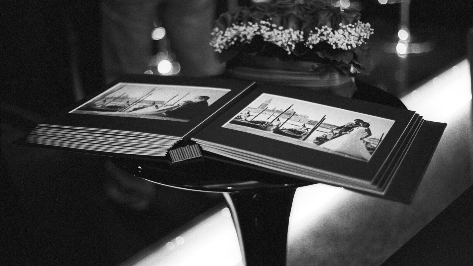
The final artwork will not live inside a computer.
It will live in a room.
That room has windows.
Artificial lighting.
Morning light.
Evening light.
Warm LEDs.
Cold LEDs.
Shadows.
Reflections.
This is another reason the best Fine Art paper cannot be determined only from a product catalog.
OX’s printing workflow specifically considers neutral whites under mixed lighting and recommends evaluating proofs under stable, gallery-like conditions. It also emphasizes controlling light exposure in the final display environment.
Canson likewise notes that the surface of the paper interacts with exhibition conditions and that matte surfaces can be particularly helpful when reflections are a concern.
This is especially important for architects and interior designers.
A beautiful print that creates constant glare under the project’s lighting is not a successful final solution.
The choice of fine art paper does not happen independently of framing.
A matte paper behind anti-reflective glazing behaves differently from an unglazed textured print.
The lighting also changes.
The viewing distance changes.
The tactile quality becomes more or less visible.
At OX, conservation-minded finishing includes tested boards, tapes and plastics, PAT considerations, and anti-reflective UV-filtering glazing. The current printing workflow specifically recommends conservation-oriented framing and notes the importance of light and UV exposure in long-term display.
That means the decision is not:
Paper → finished.
It is:
Image → paper → proof → framing → glazing → light → final experience.
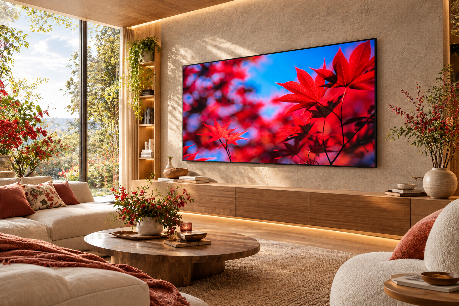
This is the practical part.
For black-and-white and restrained-color photography, the current OX workflow favors 100% cotton rag with a premium matte inkjet coating, with Hahnemühle Photo Rag 308 gsm cited as an example. The paper’s surface is valued for tonal nuance, midtone transitions, detail and archival expectations.
But that is the beginning of the decision, not the end.
We then consider:
The photograph
What is the image trying to communicate?
The tonal range
Are the shadows delicate or dramatic?
The highlights
Do we need openness and softness?
The surface
Should the print feel quiet and smooth or more tactile?
The environment
Will the work be viewed under natural light, gallery light or architectural lighting?
The size
Will the artwork be intimate or large-format?
The framing
Will it be behind anti-reflective glazing?
The final proof
Does the physical result still feel like the photograph?
The paper is approved only when those answers make sense together.
Price matters.
But it should not be the creative decision.
A cheaper paper is not automatically a poor paper.
A more expensive paper is not automatically a better paper.
The question is whether its characteristics are appropriate for the work.
Rossler’s guide explicitly notes that cost influences customer decisions even after technical and aesthetic testing, which is a realistic part of Fine Art printing.
At OX, the approach is different:
the photograph comes first.
If a paper makes the image less accurate, less emotional or less faithful to the intended result, its price does not make it the right choice.
This is probably the most important idea to take away from this article.
If you search for:
best Fine Art paper
you will find many answers.
Matte.
Baryta.
Textured.
Smooth.
Warm white.
Bright white.
Cotton.
Alpha cellulose.
Different weights.
Different coatings.
Different printers.
Different inks.
And many strong opinions.
But Fine Art printing is not a competition between paper brands.
It is an artistic decision.
The right Fine Art paper is the one that allows the photograph to become more itself.
If the photograph is quiet, the paper should not shout.
If the image is dramatic, the paper should not flatten it.
If the photograph depends on delicate transitions, the paper should preserve them.
If the image relies on powerful blacks, the paper should support them.
If texture is part of the story, the surface may need to participate.
That is how we think about paper for Fine Art printing at OX.
A digital photograph can be endlessly reproduced on screens.
A Fine Art print is different.
It is a physical interpretation.
The paper has weight.
The surface has character.
The blacks have a certain density.
The highlights have a certain softness.
The image reacts to light.
The viewer stands in front of it.
And the photograph becomes an object.
This is why fine art paper matters so much.
The choice of paper is not merely about durability.
It is about interpretation.
It is one of the final decisions through which the artist defines how the work will exist in the physical world.
For Olavo Xavier, that choice belongs to the same creative process that includes photography, editing, framing and presentation. His artistic process explicitly includes testing papers, tones and framing until the result feels right.
A Fine Art photograph is not finished when the camera captures the image.
It is not necessarily finished when the editing is complete.
And it is certainly not finished when the file is exported.
The artwork continues through printing.
Through proofing.
Through paper selection.
Through framing.
Through light.
Through the space where the collector eventually sees it.
That is why, at OX Fine Art, choosing the right Fine Art paper is treated as part of the artistic process.
We look at the image.
We consider its tonal range.
We consider its color.
We evaluate its surface.
We test.
We proof.
We compare.
And only then do we decide whether the physical print feels faithful to the original intention.
Because the goal of Fine Art printing is not to produce a copy of a photograph.
The goal is to create the photograph in its final physical form.
And when the right paper, ink, proofing, framing and light come together, something important happens:
the image stops being only something you can see.
It becomes something you can experience.
There is no universal best paper for Fine Art printing. The right paper depends on the photograph, tonal range, color, texture, lighting, framing and desired emotional effect. OX currently favors 100% cotton rag with premium matte coating for black-and-white and restrained-color work, but paper selection is evaluated image by image.
100% cotton papers are widely used for Fine Art because they can provide a premium physical feel and are available with archival characteristics suited to long-term artwork. The cotton base is only one part of the equation; coating, ink, printer, proofing and framing also matter.
Neither is universally better. Matte paper can offer restrained reflections and an understated presentation, while baryta-type papers can emphasize blacks, contrast and photographic depth. The correct choice depends on the particular image and desired result.
Yes. Texture can become part of the visual experience and can influence how detail, contrast and surface are perceived. Smooth papers often preserve a cleaner photographic appearance, while textured papers can add a more tactile or artistic character.
No. GSM describes paper weight, but quality depends on a combination of characteristics, including composition, coating, surface, tonal behavior, longevity and compatibility with the ink and printer.
Because a computer display and a physical print produce light differently. Proofing allows the artist to evaluate the actual paper surface, blacks, highlights, midtones and color behavior before final production. OX begins editions with target proofs and evaluates them under controlled lighting.
OX’s current printing workflow states that Olavo favors 100% cotton rag with premium matte inkjet coating, citing Hahnemühle Photo Rag 308 gsm as an example for black-and-white and restrained-color work because of its tonal and detail characteristics.
Yes. The paper contributes to the physical quality, visual appearance and long-term presentation of the artwork. For collectors, paper should be considered together with pigment inks, framing, glazing, documentation and display conditions. OX incorporates paper, proofing and conservation-minded finishing into its edition workflow.
• What Is Fine Art Photography? Understanding the Art Behind an Image
• How to Choose Fine Art Photography for Your Home: The Complete 2026 Guide
• How Architects Can Use Fine Art Photography to Transform Interior Spaces