Color is more than an aesthetic, it’s a feeling.
Whether vibrant or restrained, each tone carries a psychological and emotional weight.
At OX Fine Art, color is used with precision and intention, never by accident. It sets the atmosphere, evokes memory, and deepens presence within a space.
Even the absence of color — black and white — is a statement in itself.
Let your space guide you. Browse curated selections based on emotional tone and visual harmony:
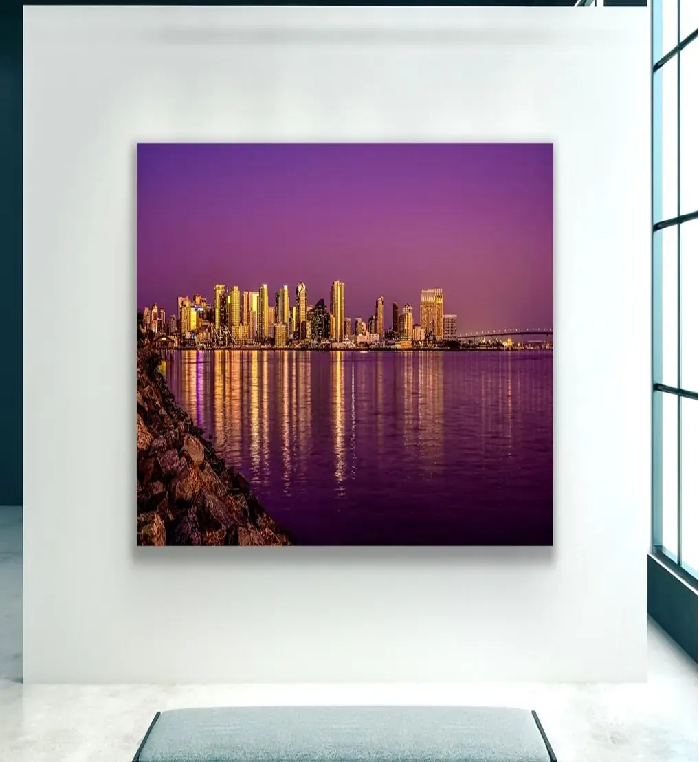
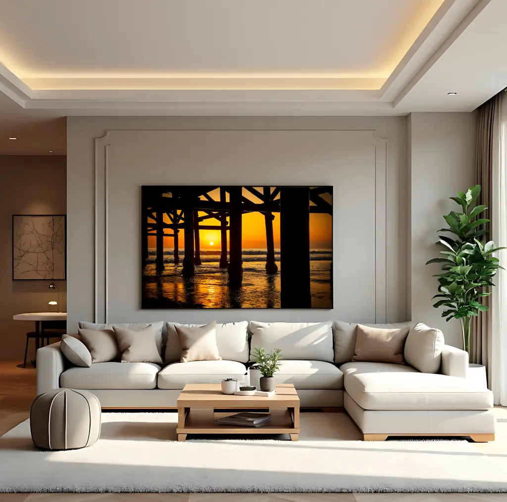
Color harmony doesn’t mean blending in, it means building a relationship between the artwork and the room it inhabits.
Here’s how to combine wall color, lighting, and decor with the tones of your fine art photography:
Need help pairing a piece with your space?

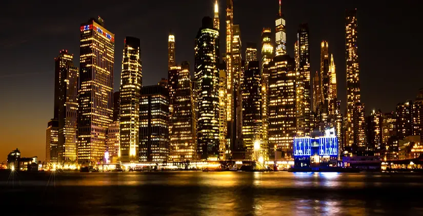
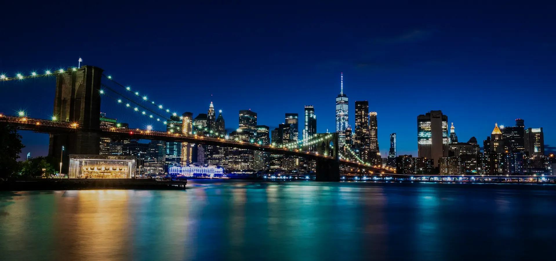
In fine art, each tone carries emotional and symbolic weight. At OX Photography, color is used not to match a room, but to transform it.
Here’s how different palettes impact the atmosphere of your environment:
Choosing artwork by color is not about matching your couch. It’s about setting the emotional tone of the room.
Browse by color, explore with intent, and choose the piece that transforms your space.
| Cookie | Duration | Description |
|---|---|---|
| cookielawinfo-checkbox-analytics | 11 months | This cookie is set by GDPR Cookie Consent plugin. The cookie is used to store the user consent for the cookies in the category "Analytics". |
| cookielawinfo-checkbox-functional | 11 months | The cookie is set by GDPR cookie consent to record the user consent for the cookies in the category "Functional". |
| cookielawinfo-checkbox-necessary | 11 months | This cookie is set by GDPR Cookie Consent plugin. The cookies is used to store the user consent for the cookies in the category "Necessary". |
| cookielawinfo-checkbox-others | 11 months | This cookie is set by GDPR Cookie Consent plugin. The cookie is used to store the user consent for the cookies in the category "Other. |
| cookielawinfo-checkbox-performance | 11 months | This cookie is set by GDPR Cookie Consent plugin. The cookie is used to store the user consent for the cookies in the category "Performance". |
| viewed_cookie_policy | 11 months | The cookie is set by the GDPR Cookie Consent plugin and is used to store whether or not user has consented to the use of cookies. It does not store any personal data. |
Take our quick art quiz and get a personalized curation by the artist.