Holiday gatherings ask your space to do two things well: welcome people and guide attention. Fine art photography for holiday hosting can do both quickly when you’re intentional about where you place a focal point, how your black-and-white palette plays with fall textures, and what hanging standards keep everything readable.
Here’s a practical, research-backed guide to make your home guest-ready with art that looks elegant under winter light and holds up to close conversation.
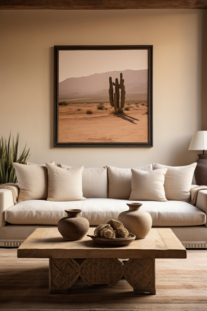
A single commanding photograph can unify mixed finishes and seasonal décor in a living or dining room. Think large scale over scatter: one piece that commands sightlines from primary seating quickly settles the room’s visual rhythm.
For ergonomic readability, designers and museum-style guides often center artworks at roughly 57–60 inches (145–152 cm) from the floor; it’s a reliable eye-level baseline you can tweak around furniture or tall walls.
Placement ideas:
If you prefer a cluster, keep centers aligned to a consistent sightline and maintain even spacing to avoid last-minute micro-adjustments during install. The eye-level rule still applies for the overall composition.
Black-and-white photographs pair beautifully with autumn materials, oak, walnut, nubby wool, aged brass, because they add structure without competing on hue. To avoid a “flat” look next to warm seasonal tones, prioritize prints with confident midtone structure and a defined highlight strategy.
Matte or baryta-type papers preserve micro-contrast and keep flare under control; anti-reflective, UV-filter glazing (such as Museum Glass) minimizes glare from candles, tree lights, and low winter sun while protecting the print.
Tru Vue lists <1% reflectance and up to 99% UV blocking for its conservation glass, useful when your home is bright during daytime hosting.
Styling tip: let textiles do the color work (rust, camel, pine green), and use B&W to carry line, scale, and mood. The result feels composed rather than themed.
Holiday lighting is gorgeous and harsh. It can flatten contrast, create mirror-like reflections, and accelerate light damage if unmanaged. Two rules keep you covered:
Practical placements:
Fine art turns into a conversation piece when it’s positioned where people pause.
Where not to hang: anywhere with direct sun or unstable humidity. Conservation bodies reiterate that sunlight is too intense and UV-rich to control effectively for light-sensitive media.
If you’re short on time before the holiday, request a ready-to-install package, framed, with anti-reflective glazing, hanging hardware matched to your wall type, and a simple diagram marking center height and offsets.
A great holiday reveal shouldn’t trade longevity for looks. Ask for pigment-based prints on museum-grade papers, framed with photo-safe components and UV-filter glazing.
Conservation guidance emphasizes both reducing UV and keeping light exposure reasonable; you’ll get better image stability for years of winter hosting if these choices are made now.
OX Fine Art delivers authorial black-and-white editions designed to read crisply under winter light and hold up over time. Our ready-to-install framing includes anti-reflective, UV-filter glazing, sightline-based hanging guides, and practical lighting notes gathered from conservation standards, so your home feels curated and conversational the moment guests arrive.
Need it before the holiday? We’ll shortlist pieces, confirm scale with quick mockups, and handle white-glove delivery and installation.
| Cookie | Duration | Description |
|---|---|---|
| cookielawinfo-checkbox-analytics | 11 months | This cookie is set by GDPR Cookie Consent plugin. The cookie is used to store the user consent for the cookies in the category "Analytics". |
| cookielawinfo-checkbox-functional | 11 months | The cookie is set by GDPR cookie consent to record the user consent for the cookies in the category "Functional". |
| cookielawinfo-checkbox-necessary | 11 months | This cookie is set by GDPR Cookie Consent plugin. The cookies is used to store the user consent for the cookies in the category "Necessary". |
| cookielawinfo-checkbox-others | 11 months | This cookie is set by GDPR Cookie Consent plugin. The cookie is used to store the user consent for the cookies in the category "Other. |
| cookielawinfo-checkbox-performance | 11 months | This cookie is set by GDPR Cookie Consent plugin. The cookie is used to store the user consent for the cookies in the category "Performance". |
| viewed_cookie_policy | 11 months | The cookie is set by the GDPR Cookie Consent plugin and is used to store whether or not user has consented to the use of cookies. It does not store any personal data. |