A 3-piece art collection is the quickest way to make a home or office feel intentional without tearing up a single wall.
When it’s planned with a clear story, balanced scale, museum-informed placement, conservation-minded materials, and clean documentation, the result reads like a private gallery, cohesive today and credible years from now.
Here’s a technical, practical guide to map your trio for 2026.
Define the collection’s job in the space
Start by deciding what the set must do: anchor a living room wall, guide movement in a hall, add calm to a bedroom, or frame a home-office backdrop. Purpose drives every technical choice that follows.
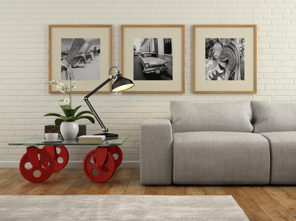
- Viewing distance → size: in seating zones about 8–12 ft from the wall, pick at least one large “anchor” that reads at a glance. Over furniture, a reliable rule is artwork at roughly two-thirds the width of the piece below; this proportion keeps visual mass balanced and avoids the “postage stamp” effect.
- Eye-level centerline: as a baseline, center the artwork at 57–60 inches from the finished floor, then fine-tune for furniture height or unusually tall ceilings. This band is comfortable both standing and seated, so your composition holds up during gatherings.
Choose a narrative and stick to it
A trio shines when the images share a single thread, place, motif, or mood. Examples: a coastline you return to, an architectural rhythm you collect, or a calm, contemplative atmosphere for a bedroom.
Keep the thread tight and let format provide variety (vertical vs. horizontal, close vs. wide). If you plan to keep seasonal décor in play, pick a tonal strategy that survives color shifts. Black-and-white with strong midtone structure integrates easily with wood, stone, brass, and winter textiles.
Engineer the visual rhythm: big–medium–small
Think like a composer. Give the eye a downbeat, then secondary beats.
- Anchor (A): the largest piece where the eye naturally lands, often above a console or sofa.
- Echo (B): a medium piece that relates by subject or geometry. It can share the same centerline or sit slightly lower over seating.
- Accent (C): a smaller work used to create cadence, placed in a niche, near a bar cart, or as a close-range “discovery” on the same wall.
When pieces share a wall, treat the group as a single rectangle that still respects the two-thirds rule over furniture. Keep edge gaps consistent, typically 2–4 inches, so the set reads as one thought rather than fragments.
Select surfaces and finishes that read in real light
Winter brings low sun angles, warm LEDs, and candlelight. Materials should preserve detail and cut glare.
- Print surface: aatte or baryta-type papers maintain micro-contrast and look refined in living spaces.
- Glazing: specify anti-reflective, UV-filter conservation glass to minimize reflections and block most UV. This keeps tonal depth intact in bright rooms and reduces long-term light risk.
- Light discipline: avoid direct sun. Even with UV filtered, visible light is cumulative; use dimmers and indirect aiming so the photograph reads clearly without hot spots.
Size, proportion, and height: formulas that just work
- Over sofas/credenzas: framed width ≈ ⅔ of the furniture width; keep 6–10 inches between furniture top and frame bottom so the set feels connected rather than floating.
- Hall series: use a shared 57–60 inch centerline for rhythm at a glance; tighten gaps to 1.5–2.5 inches for smaller works in narrow corridors.
- Bedroom: opposite the bed, drop the centerline slightly for seated/reclined viewing. Above a headboard, keep the pair or trio within the two-thirds width guideline and maintain a clean vertical gap (often 8–10 inches).
Editions, proofs, and paperwork (so the set holds value)
A credible mini-collection arrives with clean documentation:
- Edition structure: standard numbering like 3/15 means the third print in an edition of fifteen. Many artists run separate editions by size, which is why scale affects scarcity and price.
- Proofs: AP (Artist’s Proof), PP (Printer’s Proof), and BAT (bon à tirer) live outside the numbered run; if you include proofs, label them clearly and keep types consistent across the trio.
- COA & provenance: each work should include a Certificate of Authenticity listing artist, title, process, paper, image and framed sizes, edition size/number, date, and signature. Keep invoices and correspondence together. This bundle becomes the provenance record used by insurers and appraisers.
Conservation basics for 2026 (and beyond)
Simple practices protect paper-based photographs for decades:
- Placement: avoid direct sunlight, radiators, vents, and fireplaces. Favor interior walls over exterior ones to reduce temperature swings behind frames.
- Glazing: anti-reflective, UV-filter glass (often called “museum” glass) lowers glare and blocks most UV.
- Lighting: aim accent lights obliquely rather than straight at the glazing; use dimmers so exposure is only as bright and long as needed.
If your climate is dry in winter, keep indoor RH from crashing with a modest humidifier and a good hygrometer. Stability, small daily swings, is more protective than chasing a single perfect number.
Budget smart: where to invest in a three-piece plan
- Spend on scale and glazing: one commanding anchor plus anti-reflective UV glazing across the trio noticeably elevates legibility day and night.
- Unify framing: consistent moulding, mat profile, and reveals make the set read as a collection.
- Document everything: COAs and a one-page collection brief (theme, dates, edition details) add clarity for moves, insurance, and future gifting.
A 2026 rollout you can actually follow
Q1 — Curate & measure
- Pick a theme and shortlist 6–8 candidate images.
- Tape outlines on the wall to test scale; confirm the two-thirds proportion for furniture walls; mark a 57–60 inch centerline.
Q2 — Proof, frame, and plan lighting
- Approve paper and finish; specify anti-reflective UV glazing.
- Prepare a hang diagram with exact gaps and offsets; add lighting notes for aiming and dimming.
Q3 — Install anchor + one companion
- Hang A and B with final hardware. Check for glare in daylight and evening, then fine-tune aiming.
Q4 — Complete the cadence
- Add C in a discovery spot (niche, bar, entry). Photograph the installation for your records and file all COAs and invoices together.
Quick checklist (clip & keep)
- One Anchor, one Echo, one Accent (A/B/C).
- 57–60 inch centerline; 6–10 inch gap above furniture; consistent 2–4 inch edge gaps.
- Two-thirds proportional rule over sofas/credenzas.
- Anti-reflective, UV-filter glazing; avoid direct sun; dimmable accent lighting.
- Edition, proof type, COA, and provenance on file.
- Unified framing so the trio reads as a collection.
Why build it with OX Fine Art
OX Fine Art designs three-piece collections that feel authored and effortless. You get curator-led selection, scale mockups tailored to your rooms, museum-informed hang heights, anti-reflective UV glazing, and white-glove installation.
Every print ships with a detailed COA and care notes grounded in conservation guidance, so your 2026 mini-collection looks extraordinary on day one and ages gracefully.
Book a curator-led selection call and let’s map your Anchor–Echo–Accent set now.